Camp Brigitte is an indigenous-owned lodging and vacation located in upper west Ontario.


A prime destination for overnight stays, gatherings/parties, hunting, bonfires, and winter activities. Looking for a logo they wanted to show their key focus on family and friends integrating with nature.
This is a project I did with the Bloom + Brilliance team, which you can see here.
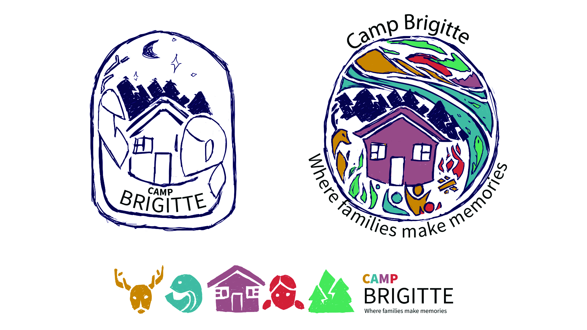
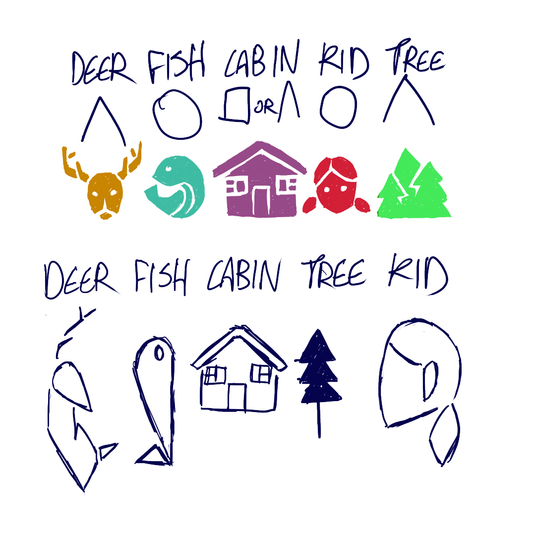
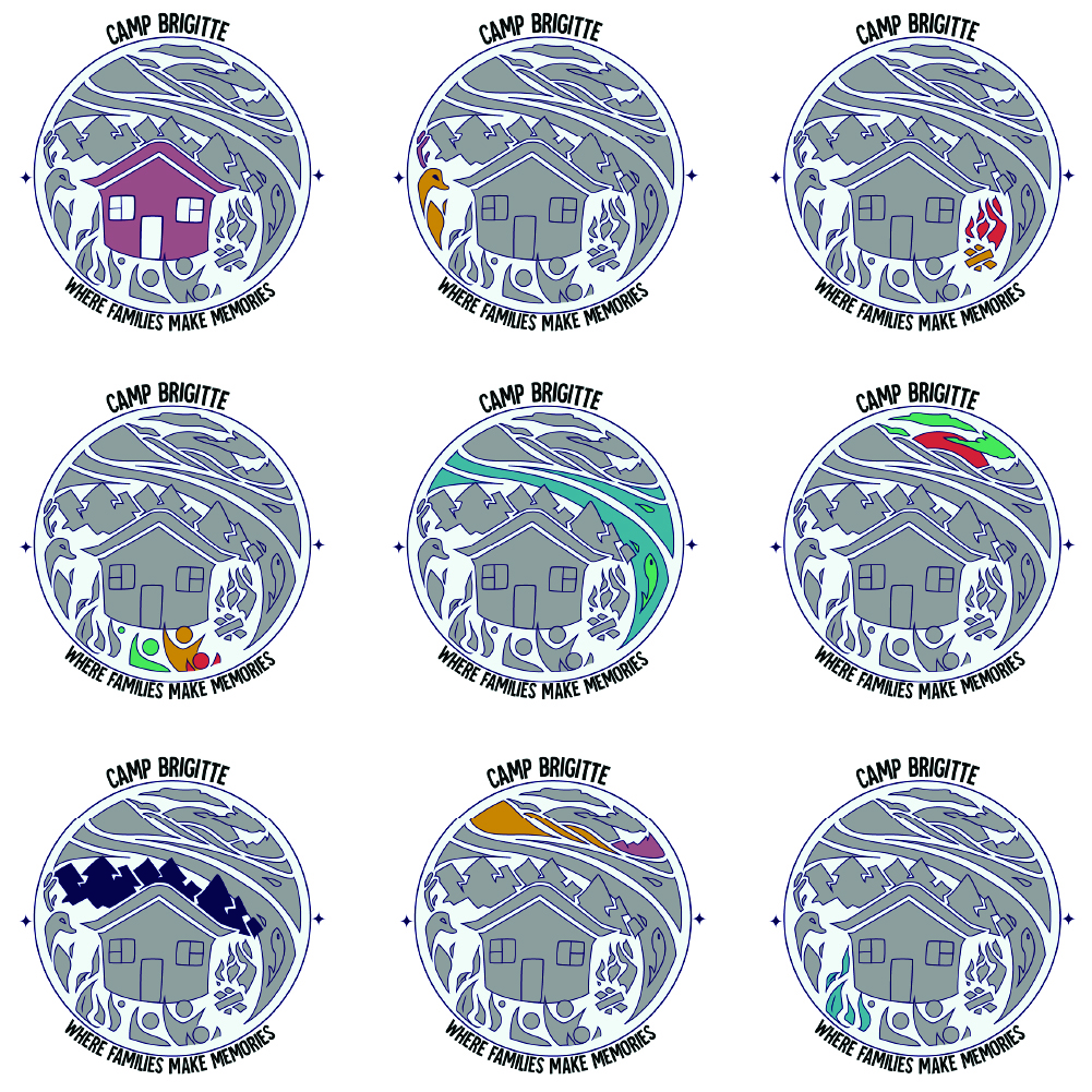
A main focus with this client was wanting to include key elements of the camp and activities there in the logo; trees/forest, people, animals, and the cabin itself.
I first experimented with 3 different looks to the logo and placement/amount of elements. The first is more of a badge look and focuses on the deer and 1 person, the second is a much more full logo with a full scene including the cabin, and the third is a simplistic linear logo; with each element specifically shaped.
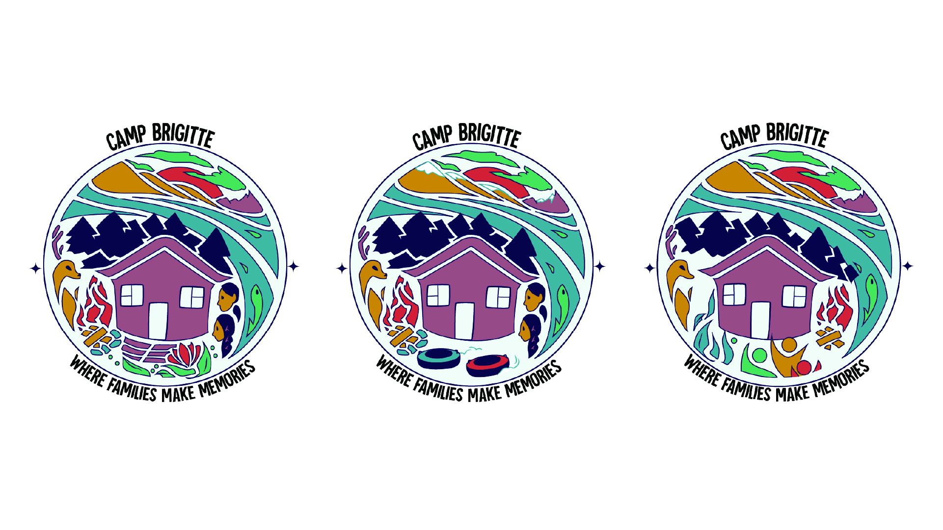
Choosing to move forward with the circular logo I worked on different variations, pulling the girl back from the previous designs adding another child. I also experimented with a seasonal variation showing winter activities.
Then moving forward with the help of Janelle Desrosiers we transitioned it into the final version. Simplifying the logo while bringing the text up much more. We pulled the deer and children forward, centering the bonfire in front of the cabin, and brightened the colours. Tieing them with meaning and connection to their brand focus to make everything cohesive.